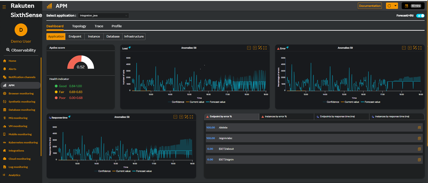
APM dashboard
- Log in to the SixthSense Observability portal.
- Click APM on the left pane. The SixthSense Observability Standard dashboard appears with the standard metrics and the respective graphs.
- Select an application from the Select application drop-down list.
- Select the Forecast(+6h) toggle button. You will see the
 icon against few metric names in the widgets.
note
The Forecast(+6h) toggle button is available only for SixthSense Observability Premium users and only for APM, VM, and Kubernetes monitoring capabilities. Forecast values are available only for a few metric widgets. For the available metrics list, see Benefits.
A screen similar to the following appears.
note
For SixthSense Observability Premium, data is available only for the past 60 minutes and forecast values are displayed for the next 6 hours.
You can view the Confidence, Current value, and Forecast value for the following metrics in the respective widgets. Clicking on any of these legends will disable it from the graphs. The colored lines depict the confidence, current, and forecast values. The blue shaded area in the graph, represents the dynamic baseline. For more information about what the colored lines denote, see Legends in widgets.
For more information about managing widgets, see Managing widgets and for information about disabling legends within a widgets, see Disabling legends in widgets.
You can expand a widget and work with the graphs and view the anomalies, breaches, and threshold details. For more information about expanding the widgets, see Expanding a widget.
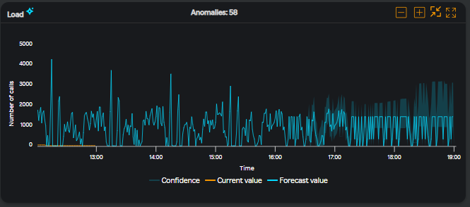
Load
The following load graph displays 58 load anomalies in a period of 60 minutes and the forecast value for the next 6 hours. Hovering on the graph displays the threhold values that you have set which help distinguish between the normal and abnormal loads.
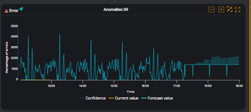
Error
The following error graph displays 59 error anomalies in a period of 60 minutes and the forecast value for the next 6 hours. Hovering on the graph displays the threhold values that you have set which help distinguish between the normal and abnormal errors.
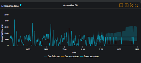
Response time
The following response time graph displays 58 response time anomalies in a period of 60 minutes and the forecast value for the next 6 hours. Hovering on the graph displays the threhold values that you have set which help distinguish between the normal and abnormal response times.